06 Jul The Power of Palette: A Guide to Creating a Personal Color Palette that Communicates Your Identity

Have you ever felt drained by the process of choosing what colors to wear in the morning? Or perhaps you’ve bought a beautifully colored piece of clothing, only to never wear it because it just doesn’t feel like “you.” – Personal Image
The problem usually isn’t that you “don’t have a sense for color,” but rather that you don’t yet have a “color blueprint” that is truly your own. As a designer who delves into structure, I believe that color is not just a matter of aesthetics; it is the most powerful “language” for communicating one’s identity. Today, we will design that language together.
Deconstruction: Decoding Personal Color
First, we must abandon the old belief that Personal Color is merely about categorizing yourself as a “summer” or “winter” type. That is only an analysis of the “hardware” (skin tone, hair color). From an architect’s perspective, we must deconstruct deeper into the “software,” which is:
- Structure: Where are the strong points of your physique? Perhaps it’s your elegant shoulders, a defined waist, or long legs.
- Lines: What are the curves and straight lines of your body?
- Proportion: What is the relationship between the length of your upper and lower torso?
When we understand these components, we can then design a palette that truly “works” for you.


The Blueprint: Architecting Your 3-Tier Personal Palette
I propose an “architect’s” framework for creating a color palette, which consists of three tiers to build a harmonious and versatile system:
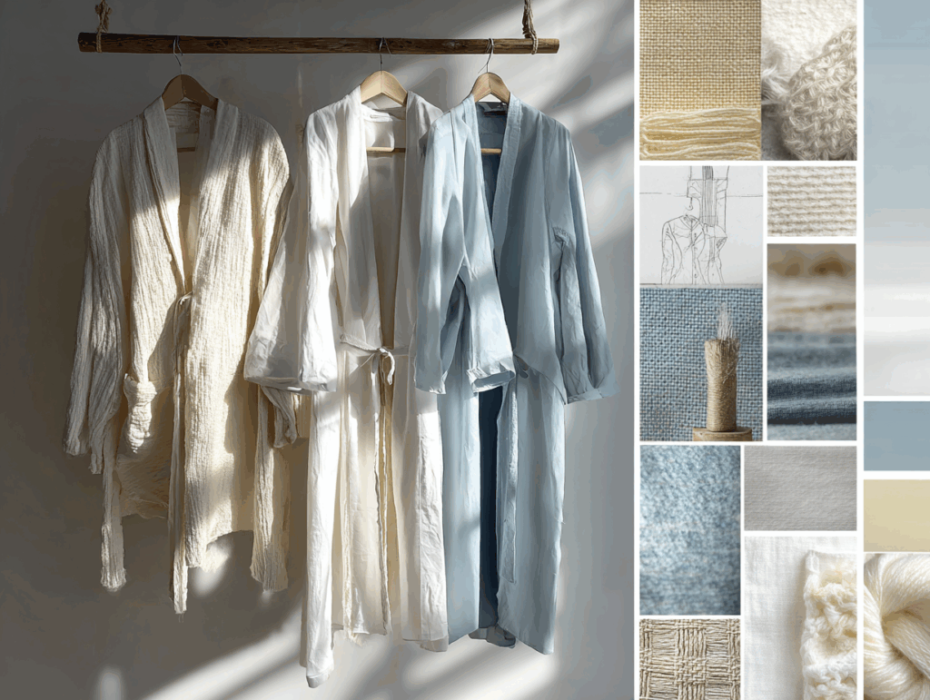
- The Foundation: 2 Base Colors
- What it is: These are the foundational colors of your wardrobe, typically the most versatile dark or neutral shades like Navy, Charcoal Grey, or Beige.
- Why you need it: This is the “structure” that makes daily dressing easy and fast.
- The Support: 2-3 Neutral Colors
- What it is: These are the colors that connect and create balance. They are often lighter shades that complement your base colors well, such as Off-White, Cream, or Light Blue.
- Why you need it: This is the “walls and negative space” that allows your base colors to stand out without appearing too heavy.
- The Accent: 1-2 Signature Colors
- What it is: This is your “signature” color, used sparingly to create points of interest and express your taste. It could be an Olive Green, a Camel brown, or a Burgundy red.
- Why you need it: This is the “piece of art” or “statement furniture” that makes your architecture complete and memorable.

Build: Creating Your Own Language
Having a “Power Palette” does not limit your creativity. On the contrary, it provides you with a “blueprint” that liberates you from confusion and Decision Fatigue, allowing you to use your mental energy on more important matters.
The journey of deeply discovering and designing your personal color palette is the heart of our Specialist Color Analysis and Personal Image Architecture services. In this process, we act as your co-architect to analyze and create a palette that will become your most powerful language.
Let’s begin designing your language together.
Sorry, the comment form is closed at this time.